Fintech navigation case study
TWINO
Revitalizing user engagement through a navigation redesign: reducing bounce, improving in-app conversions, and turning a fragmented journey into a clearer fintech product flow.

Impact targets
The numbers that shaped the redesign
The original case framed the work around engagement recovery: diagnose the friction, define measurable goals, and redesign the navigation around the actions users were trying to complete.
High abandonment signaled that the existing navigation felt complex and non-intuitive.
Core actions inside the app were underperforming because users struggled to find the next step.
The navigation rethink had to reduce friction quickly and make the structure easier to scan.
Success meant increasing confidence in key flows like payments, history, and application steps.
Context
From friction to flow
The original Twino story began with a product that had useful capabilities but too much complexity in the way people reached them.
Problem statement
A fintech application experienced declining user engagement metrics, with a bounce rate of 65% and a conversion rate of only 8% for in-app actions. The complexity and non-intuitive design of the navigation were identified as the primary reasons for frustration and abandonment.
- Users had trouble finding popular features fast.
- Critical actions took too long to complete.
- The structure did not clearly support new and returning users alike.
Solution
The redesign focused on clarifying the navigation system, simplifying the application flow, and reorganizing information architecture around real user intent. The goal was to cut bounce by 15% and lift in-app conversions by 20%.
- Audit the current journey and identify navigation dead ends.
- Prototype faster routes to high-value actions.
- Release with cross-platform QA and measurable success criteria.
Process
From research to release
The original page already carried a clear process spine. Here it is organized into a two-level structure: four headline phases and four detailed delivery stages.
High-level flow
The role stayed rooted in product research, UX architecture, prototyping, and release support.
Research
Analyse
Prototype
Release
01
Research
Benchmark successful competitors, review metrics, and map user segments.
02
Analyse
Turn evidence into hypotheses, priorities, and a clearer navigation architecture.
03
Prototype
Build and test new routes to payments, history, and application tasks.
04
Release
Implement mobile-first, validate across platforms, and optimize performance.
Stage 1
Research and diagnosis
Establish where the current navigation was failing and which journeys created the biggest drop-off.
- Analyze current metrics and identify the highest-friction moments.
- Review competitor navigation structures to understand best practices.
- Segment users by behavior and goals, including new users and power users.
- Document the existing information architecture and navigation logic.
Stage 2
Goal setting and hypothesis development
Translate the audit into focused redesign bets with clear product and UX success criteria.
- Set SMART targets for bounce reduction and in-app conversion growth.
- Prioritize navigation opportunities with a simple decision matrix.
- Define where shorter flows, clearer labels, and better affordances could unlock value fastest.
- Choose MVP scope for the first pass of the navigation redesign.
Stage 3
Prototype development and testing
Design new flows, validate them quickly, and compare variants before implementation.
- Create low-fidelity wireframes and high-fidelity interactive prototypes in Figma.
- Design new flows around payments, transaction history, and other popular actions.
- Run A/B testing on navigation alternatives and collect qualitative feedback in focus groups.
- Measure time-to-complete tasks and track changes in user satisfaction.
Stage 4
Implementation
Ship the redesign across platforms and make sure the new navigation holds up in production.
- Collaborate with development to implement the redesigned navigation.
- Follow mobile-first design principles for responsiveness and clarity.
- Test across iOS, Android, and web to confirm consistent behavior.
- Fix bugs and optimize performance to keep navigation fast.
Research
Evidence behind the redesign
The case combined competitor benchmarking, user-ex research, metrics review, and an information architecture pass to reveal where the product structure was getting in the way.
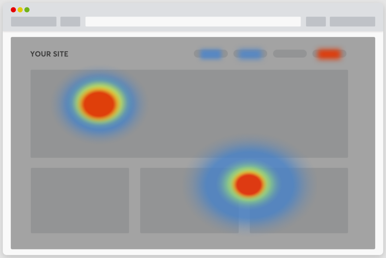
Attention map
Used to frame how users visually distributed attention and where the current interface was under-signaling the next action.
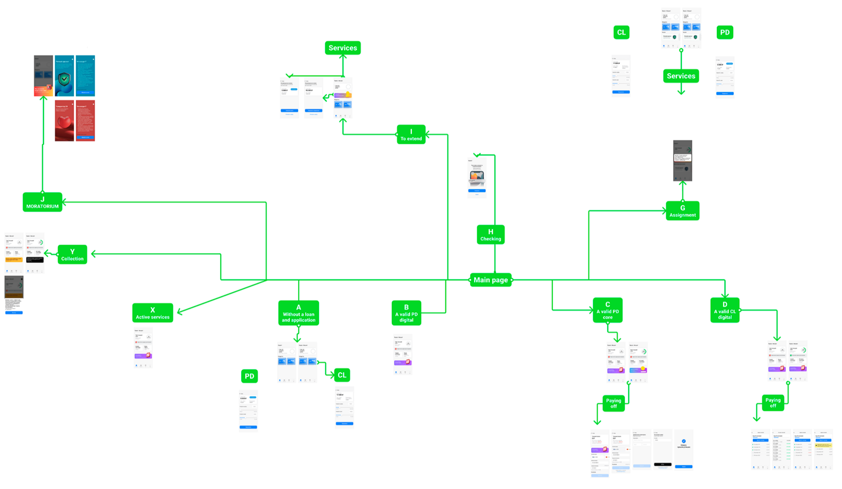
Navigation architecture map
The redesign work required untangling multiple service and repayment branches into a clearer navigation system.
The original project content highlighted three complementary research modes: competitor analysis, user segmentation, and practical testing of structural hypotheses.
Competitive research
Navigation structures of successful competitor apps were reviewed to identify proven patterns and more legible routes to high-intent actions.
User-ex research
Users were segmented by demographics, behavior, and goals, especially the difference between first-time users and more advanced recurring ones.
Current-metrics diagnosis
The redesign looked at bounce, completion time, and conversion through key flows to understand where navigation friction had the largest business cost.
Hypothesis framing
The resulting redesign principles focused on discoverability, shortened forms, clearer progress feedback, and faster access to the product’s core jobs.
What changed
Concrete product decisions
The original page listed specific interventions inside the journey. Here they are regrouped into clearer decision blocks so the case reads more like product work than a raw export of notes.
Front-load value in the application flow
Move the promo-code field from the final step into the first step so the benefit is visible immediately and users are more willing to continue.
Shorten the application form
Reduce the required fields to the essentials, leaving only full name and passport where possible to lower effort early in the journey.
Make progress feel safer
Add success marks and clearer completion feedback so users understand what is done and what remains ahead.
Improve assisted input
Integrate address autofill with DaData and add example hints to reduce errors and help users complete forms with less uncertainty.
Unify the calculator logic
Make the product calculator work consistently for all client types so the interaction model is easier to learn and reuse.
Simplify card linking and verification
Remove unnecessary checks during card linking to reduce drop-off in one of the most sensitive moments of the journey.
Support faster identity and data entry
Introduce MobileID support and combine questionnaire steps where it helps users move through the onboarding without needless fragmentation.
Grow clarity and average order value together
Expose related services more deliberately while restructuring the main offering so upsell moments do not obscure the primary path.
Screens and artefacts
How the redesign was documented
The case mixes public-facing product visuals with internal architecture artefacts. Public product screens are shown as a proxy where NDA constraints limit the exact release views.
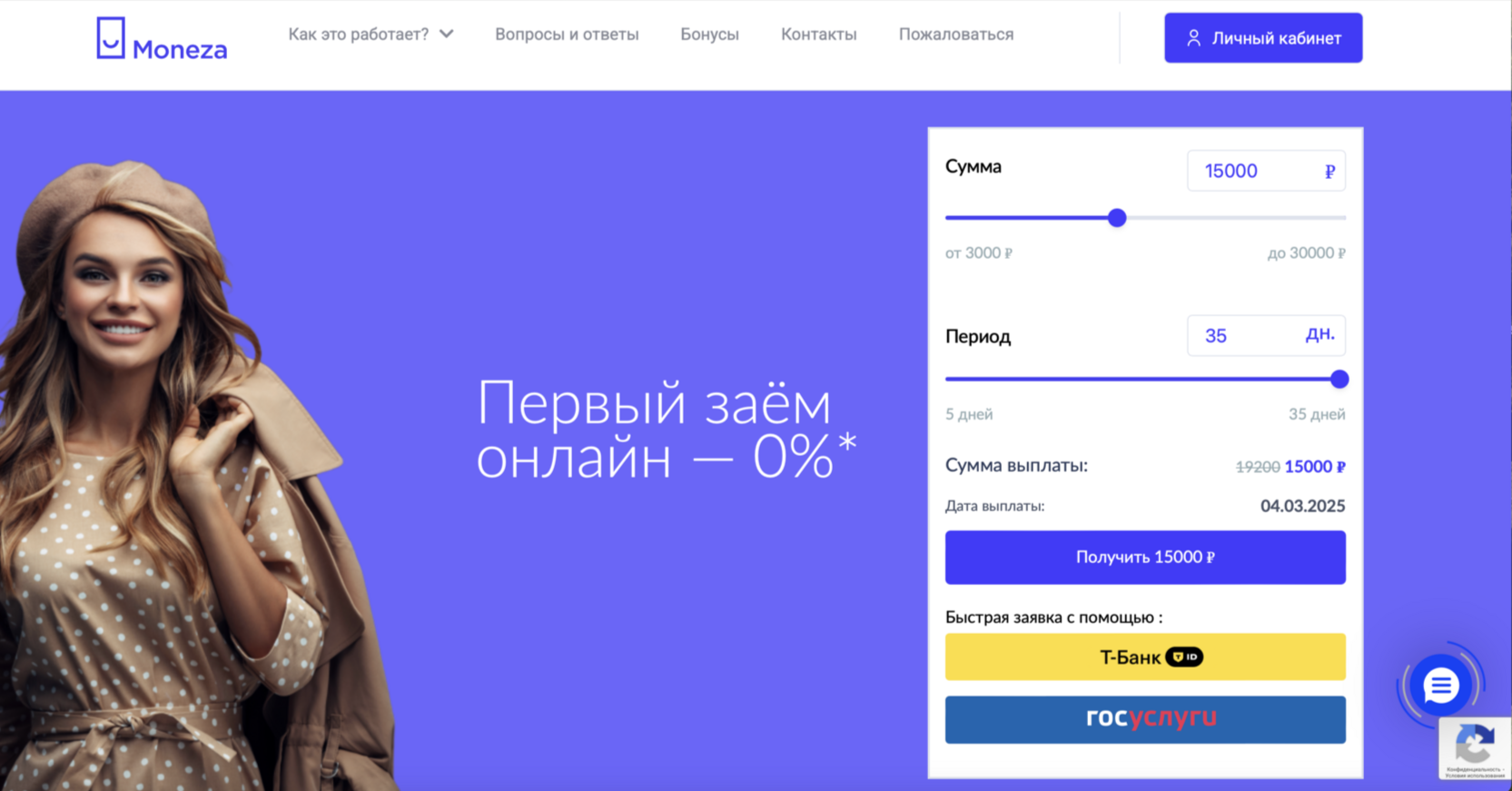
Product entry point
A public-facing screen used to represent the kind of loan-entry and calculator experience that informed the redesign.
Flow architecture
A high-level map used to rationalize multiple branches, statuses, and repayment paths into a more coherent structure.
Research signal
Attention and behavior patterns were used to support decisions about discoverability, emphasis, and simplified navigation paths.
Results
What the redesign needed to deliver
Even more than a visual cleanup, the Twino case was about restoring trust in the product structure and making critical actions feel easier to start and finish.
Outcome framing
The redesigned navigation was intended to reduce abandonment, make the application flow feel lighter, and improve access to the tasks users returned for most.
- Clearer pathways to payment processing, history, and repayment tasks.
- Fewer dead ends and less cognitive load in the application journey.
- More consistent interaction patterns across mobile and web contexts.
- Validation through A/B testing, focus groups, and implementation QA.
Delivery snapshot
The project combined product thinking and UX execution across research, prototyping, and release support.
12 weeks
From diagnosis to implementation and testing.
120+ screens
Across navigation, supporting flows, and release artifacts.
20% goal
Target growth for in-app conversions after the redesign.